第一阶段
费舍住宅的第一个方案似乎是一个双核计划,由一个类似于威斯住宅的流线组织方式。平面方正,立面有一系列的突出物和凹室,形成了主要的开口元素——似乎是为了将它们的目的与立面的其他部分区分开来。与路易斯康当时的大部分住宅作品不同,连接点没有包含入口点,主入口位于门厅内,属于睡眠空间。
此外,医生的办公室也被纳入了该计划,位于卧室的一层。一个独立的侧入口在其中的一个投影中创建,它实际上成为了一个多功能体块,属于家庭和医生。从组织的角度来看,路易斯康使办公室尽可能远离住宅的居住部分,将住宅内的白天生活与办公室的主要白天功能分开。因此,当夜幕降临时,这个空间没有被费舍博士的实践所占据,而家庭成员则睡在这个体量内。康以一种有趣的方式划分了住宅内部的流通。生活空间保持在一个水平,而睡眠空间包含不同的楼层和最小的水平运动。这种方法在其自身的层次上个性化每一个功能,为医生的办公室、主卧室、儿童卧室和拟议的女仆房间创建了单独的空间。
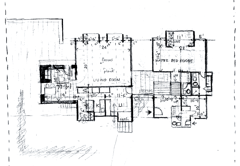
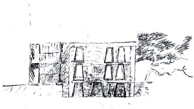
1961年8月3日的外部草图显示了住宅形式的变化,屋顶线条变得更加规则,餐厅立方体的立面在顶部附近逐渐变细。草图的阴影部分揭示了路易斯康对立面不同深度的想法,他的图描述了对特定窗户布置的分析。许多立面都采用了一种直线型钥匙孔窗类型,生活和睡眠体块似乎主要是沿着北部的玻璃,而南立面有更窄的垂直和水平开口。由于医生的办公室仍然位于睡眠体块的东南侧,减少立面开口的选择可能是对公共和私人空间划分的回应。西立面的草图,展示了餐厅立方体的屋顶和开口,以及生活区的可见开口,突出了窗户设计的形式,康手里拿着一张说明“像埃西里克住宅一样,把百叶窗拉得很深。”
“深框百叶窗”是一系列凹进去的窗袋,轻微的多功能侵入空间,在创造室内书架的同时赋予立面深度。窗户后退最实用的一面是它们提供的私密性和人性化,创造出沿着立面的变化,投射阴影,给形式赋予质感。它们不仅打破了立面的平面性,将外部引入室内,而且在暴雨期间允许打开窗户,因为它们的形式自然地防止水的渗透。
在这一阶段,康也开始考虑墙壁部分的组装,细节材料,尺寸,组成和连接。图纸上的说明指出,所有的柱子、横梁和板都将暴露在外,但具体暴露的程度因位置而异。康向用户展示了这个结构,几乎是在告诉他们它在空间和光的创造中的存在和作用,但他不允许它成为空间本身的一部分。
平面从以前的迭代中得到了简化,在保持室内空间的双核组织的同时,连接体量被集成到主体量的直通入口走廊所取代。主入口从南立面的平面向后设置,创造了一种入口凹室。与夏皮罗住宅的第一个方案相似,入口凹室减少了视觉尺度,充当室内外的过渡空间。走廊创造了一个宽阔的正式入口,允许室内体量和外部体量之间的三面运动。此外,中心位置的两个主轴的创建强调了内部和外部生活的和谐。
第二阶段
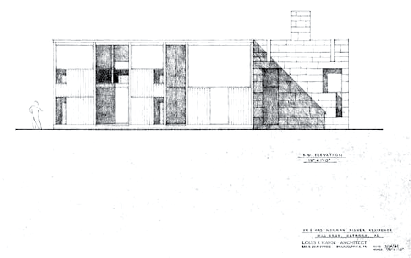
第二个方案开始于1962年3月9日的图纸,标志着康放弃了之前住宅设计中使用的双核计划。房子的平面变得更加紧凑,被拉到一个带有砖石立方体的直线体块中。尽管远离了两个不同的体量,但是布局仍然与方案一保持一定的一致性,因为起居和睡眠单元仍然位于房子的相对部分。在第一个方案的第二次迭代中出现的入口大厅被集成到一个中心大厅中,连接了房子的每一半。Kahn区分了主入口和办公室入口(位于建筑南侧),为家庭创建了一个入口凹室,同时使办公室门与外部表面齐平。住宅入口凹室沿着立面创造了一个神秘的时刻,将人引入建筑,而办公室门则通过其朴素的平面反映出医疗空间的朴素和贫瘠。

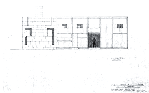
客厅保留了一层高水平的玻璃窗,只有一块玻璃的宽度和二楼的高度。虽然外部的材料仍然是三英寸厚的柏木壁板,但元素和几何结构的组织缺乏细化。根据立面图,百叶窗被渲染成朴素的木质元素。在Esherick House的类似作品中发现的传统主题没有被呈现出来,这说明了另一个可能是对外部“服务”元素的新处理的探索——具体来说,是门和百叶窗,它们通过允许或阻碍光线来服务于室内。Kahn通过将其转化为立面组成,强调了隐藏的结构;门楣由开口上方的水平板表示,而分隔窗户的柱子同样以垂直方式表示。隐藏垂直墙板之间接缝的水平水位缺乏一致的语言。不再像他们在第一个方案中所做的那样直接表示楼层高度,元素被组织起来,试图携带横贯立面的水平线,以增强视觉凝聚力,导致每个立面都有不同的组成。此外,前面提到的门楣设计用于位于西南立面的地下水位之上,由于不相关的原因而混淆了使用。
第三阶段
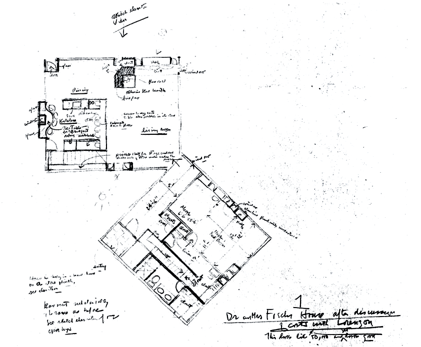
路易斯康从孟加拉国达卡实地考察回来后,彻底重新审视了费舍住宅的设计方案。基于他对国会大厦清真寺朝向的认识,康似乎把费舍住宅作为一个小规模的测试对象来探索立方体体量动态并置的实现。
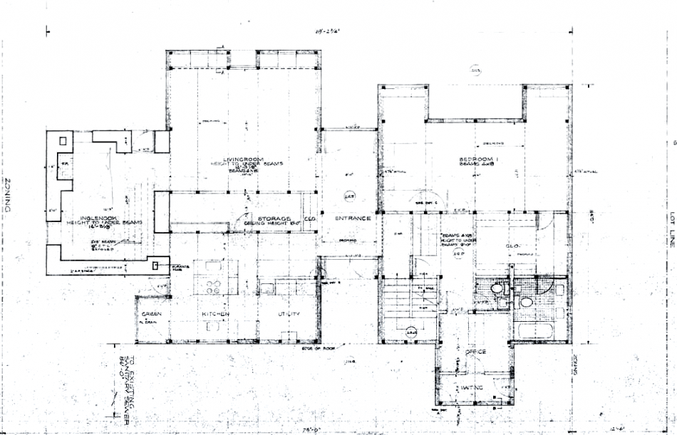
康回到了他的双核计划,将“住宅”的两个主要功能分隔成各自的立方体,每个立方体的朝向和材料都不同。两个立方体在一个角落连接,入口大厅作为体量之间的过渡元素;虽然被安置在睡觉的立方体内,大厅的轴向质量——视觉上不受阻碍的每一端,创造了室内外的连接——促进了四个方向的循环。虽然以类似于Erdman Hall的方式连接,但两个立方体以45度角并置,形成了“生活”和“睡眠”体量之间的独特轮廓。路易斯康指出,“建筑师总是希望建筑能在某种程度上使自己成为一个整体,而不是由一些取悦视觉的部分组成。”这是一个快乐的时刻,当一个几何图形被发现,它倾向于自然地创造空间,因此,在平面中几何图形的组成是用来建造、发光和创造空间的。并置解放了个体体量,从四面接受光线,前瞻性地改变了内部特征。此外,形式的改变使路易斯康重新思考了项目;医生的办公室和游戏室都不见了。
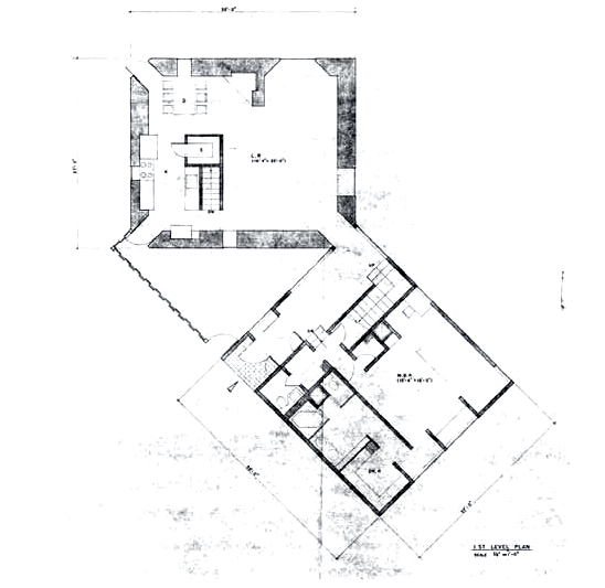
空间的组织不断演变,主要是餐厅在住宅环境中的角色的定义。前两个方案将餐厅作为住宅的核心,而第三个迭代将餐厅和厨房与整个“生活”功能相结合,但最终产生该方案的是两个广场的动态并置。该产品是一个开放的、通高的生活区,围绕着突出的壁炉,只被分隔得很轻的厨房隔开。厨房由两个8英尺高的隔板围起来,在视觉上与空间的其余部分分隔开来,同时与餐厅和起居区相连。虽然厨房变得有些分隔,但它从四面八方都可以进入,继续表明它是现代家庭的中心。康认为:
“你永远不应该侵犯柱与隔墙之间的空间。这就像头在一个房间里睡觉,脚在另一个房间里睡觉一样,这是绝对不行的。”
厨房的划分标志着对早期方案的回归,该方案将厨房和餐厅分隔开来,这是后期设计方案中最令人沮丧的一个方面,因为康几乎被并置和它对空间安排的限制所束缚。”但厨房的位置在一个相对开放的平面内——以及它与餐桌的轴向关系——保持了它在房子里的角色,厨房向外开放的“早餐桌”作为补充。早期的设计将饮食空间与生活空间隔离开来,并置的设计将三个主要的“生活”功能整合到一个体量中。路易斯康决定不在整个砌体“生活”体量的设计中创建一个从地板到天花板的隔断,这可能意味着卡恩方面的一个合理化,即所有三个元素都作为住宅内的基本空间相互关联。
在起居室里,窗户更自由;他们向外眺望风景。尤其是你的房间,你可以把树从外面带到里面,你认为起居室的大部分空间不需要亲密和隐私。在卧室里,你倾向于减少开窗,但永远不要减少到墙壁无法接收一天中的心情和一年中的季节。当你起床的时候,你仍然想要感觉到你被房间拥抱着。这不是你在客厅里的感觉。
Kahn as quoted in, “A House Within a House.”
第四阶段
从康1963年12月的一些草图开始,最终形式开始显露出来。整个房子被设计成木质,保持了之前睡觉的立方体的布局,同时回归到早期的设计,设计了一个轻分区的厨房。在描述这一设计时说,“从理论上讲,房子是一座建在石头基座上的木头房子。”
第五阶段
What appears to be the first scheme for the Fisher house was a binuclear plan connected by a circulation hyphen similar to the Weiss house. The plan was rectilinear in form with a series of projections and alcoves that created the major aperture elements – as if to distinguish their purpose from the rest of the façade. Unlike the majority of Kahn’s residential work of the period, the hyphen did not contain the point of entry; the main entrance was located within a foyer that belonged to the sleeping volume.
Also integrated into the plan was a doctor’s office, located on the ground floor of the sleeping volume. A separate side entrance was created within one of the projections, which really became a multi-functioning volume belonging to both family and doctor. From an organizational standpoint, Kahn kept the office as far away as possible from the living portion of the house, separating daytime life within a home from the predominately daytime function of an office; thus, when evening arrived, the space is unoccupied by Dr. Fisher’s practice while the family sleeps within the volume. Kahn divided the circulation within the home in an interesting fashion; the living volume was kept to one level while the sleeping volume contained varying floor levels and minimal horizontal movement. This method individualizes each function on its own level, creating separate spaces for the doctor’s office, master bedroom, children’s bedrooms, and the proposed maid’s room.
An exterior sketch dated 3 Aug 1961 denotes a change in the form of the house, as the rooflines become much more regular and the elevation of the dining cube is tapered near the top. The sketch is shadowed to reveal Kahn’s thoughts regarding the varying depth of the façade and his measured drawings depict the analysis of specific window arrangements. A sort of rectilinear keyhole window typology is used on many of the facades, and it appears that the living and sleeping volumes are predominately glazed along the north while the south façade has much narrower vertical and horizontal openings. As the doctor’s office is still situated along the southeast side of the sleeping volume, the choice to minimize the openings along the façade was likely a response to the division of public and private spaces. A sketch of the west elevation, showing the roofline and openings of the dining cube along with the visible apertures of the living volume, highlights the form of the window design with a note in Kahn’s hand stating
“deep set shutters as Esherick.”
The ‘deep set shutters’ are a series of recessed window pockets, slight multifunctional intrusions into the space that give depth to the façade while creating an interior shelf. The most practical aspect of the window recessions is a sense of privacy and humanity they provide, creating variations along the facades that cast shadows and give a texture to the form. Not only do they break the planarity of the façade and bring the exterior inside, but they allow for an open window during a heavy rainstorm, as their form naturally protects against water infiltration.
The ‘deep set shutters’ are a series of recessed window pockets, slight
multifunctional intrusions into the space that give depth to the façade while creating an interior shelf. The most practical aspect of the window recessions is a sense of privacy and humanity they provide, creating variations along the facades that cast shadows and give a texture to the form. Not only do they break the planarity of the façade and bring
the exterior inside, but they allow for an open window during a heavy rainstorm, as their form naturally protects against water infiltration.
During this phase Kahn also began to think about the assembly of the wall sections, detailing materials, dimensions, composition, and connections. A note on the drawing states that all columns, beams and decking would be exposed, yet the degree to which their exposure was detailed varied depending on location. Kahn showed the user the structure to almost inform them of its presence and role within the creation of space and light, but he did not allow it to become a part of the space itself.
The plan was simplified from the previous iteration; the circulation hyphen was replaced by a pass-through entry corridor integrated into the main volume while maintaining the bi-nuclear organization of interior spaces. The main entry was set back from the plane of the south façade, creating a sort of entry alcove. Similar in approach to the first scheme of the Shapiro house, the entry alcove reduced the visual scale to act as sort of transitional space between inside and outside. The corridor created a broad formal entry that allowed for tripartite movement between both interior volumes and the exterior. Furthermore, the creation of two main axes with a centrally-located origin emphasized the harmony of both interior and exterior life.
The second scheme, beginning with drawings dated March 9, 1962, marked an abandonment of the bi-nuclear plan that Kahn had utilized in previous residential designs. The plan of the house became much more compact, pulled together into a rectilinear volume with an attached masonry cube.20 The layout remained somewhat consistent with Scheme One despite the transition away from two distinct volumes, as the living and sleeping units were still situated on opposite halves of the house. The entry hall that appeared in the second iteration of the first scheme was integrated into a center hall that connected each half of the house. Kahn differentiated between the main entrance and the office entrance – which was located along the south side of the building – by creating an entry alcove for the family while situating the office door flush with the exterior surface. The residential entry alcove created a moment of mystery along the façade, drawing the person into the building, whereas the office door reflects the austerity and sterility of a medical space through its unadorned planarity.
The living room retained a high level of glazing, with a single pane that ran the width of the space and the full height of the second story. While the material of the exterior remained three-inch-thick cypress siding, the organization of elements and geometries lacked refinement. According to the elevation drawings, the shutters were rendered as unadorned wood elements. The traditional motifs found in similar pieces at the Esherick House are not represented, illustrating yet another departure that may have been an exploration of a new treatment of exterior ‘servant’ elements – specifically, doors and shutters, which serve the interior by permitting or obstructing light. Kahn accentuated the hidden structure by translating it onto the façade composition; lintels are represented by horizontal boards above openings, while columns separating windows are similarly expressed in a vertical fashion. The horizontal water tables that hide the joint between the vertical siding lack a consistent language. No longer directly representing floor heights – as they did in the first scheme – the elements are organized in an attempt to carry horizontal lines across the façade for visual cohesion, resulting in a varied composition along each façade. Furthermore, the aforementioned lintel contrivance is used above the water tables situated on the southwest façade, muddling the usage by employing it for unrelated reasons.
Upon returning from a site visit to Dacca, Kahn completely re-examined the scheme for the Fisher House. Based on his realization regarding the orientation of the mosque at the Capitol Complex, it is as though Kahn treated the Fisher House as a smallscale test subject to explore the implementation of a dynamic juxtaposition of cubic volumes.
Kahn returned to his bi-nuclear plan, separating the two main functions of ‘house’ into their own cubes, differing each in orientation and material. The two cubes were joined at a corner, with the entry hall acting as a transitional element between volumes; while housed within the sleeping cube, the axial quality of the hall – visually unobstructed on each end, creating a connection between interior and exterior – facilitated circulation in four directions. Though joined in a similar fashion to Erdman Hall, the juxtaposition of the two cubes at a 45-degree angle results in a unique delineation between ‘living’ and ‘sleeping’ volumes. Kahn noted, “It is always the hope on the part of the designer that the building in a way makes itself rather than be composed with devices that tend to please the eye. It is a happy moment when a geometry is found which tends to make spaces naturally, so that the composition of geometry in the plan serves to construct, to give light, and to make spaces.” The juxtaposition freed the individual volumes to receive light on four sides, prospectively altering the interior character. In addition, the change in form led Kahn to rethink the program once again; gone are the doctor’s office and the playroom.
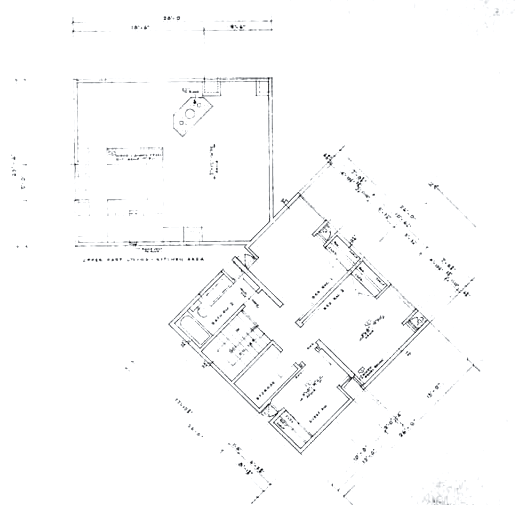
The organization of spaces continued to evolve, primarily with the definition of the dining room’s role within the context of the house. Whereas the first two schemes focused on the dining room as the heart of the house, Kahn’s third iteration integrated the dining room and kitchen with the entirety of the ‘living’ functions, but it was the dynamic juxtaposition of the two squares that ultimately generated the scheme. The product was an open, full-height living area, based around the extruded fireplace and divided only by the lightly-partitioned kitchen. The kitchen was bounded by two eight-foot partitions, visually separating it from the rest of the space while connecting to both the dining and living areas. Although the kitchen became somewhat compartmentalized, its accessibility from all directions continued to signify it as the center of the modern home. Kahn believed, “you should never invade the space between columns with partition walls. It is like sleeping with your head in one room and feet in another…that will never do.” The partitioning of the kitchen marked a return to the earlier scheme that separated the kitchen and dining rooms, an aspect of the later design schemes that exhibited the most frustration, for Kahn became almost bound by the juxtaposition and the limitations it placed on the arrangement of spaces. But the kitchen’s placement within a relatively open plan – along with its axial relationship with the dining table – maintained its role within the house, supplemented by the later ‘breakfast table’ that the kitchen opens up to. Where earlier plans isolated the eating spaces from the living space, the juxtaposed plan consolidated the three main ‘living’ functions into one volume. Kahn’s decision not to create a floor-to-ceiling partition within the design of the entirely masonry ‘living’ volume could connote a rationalization on Kahn’s part that all three elements were interrelated as essential spaces within a house.
The windows are much freer [in the living room]; they look out onto the landscape. Especially yours, where you can bring the trees from outside inside and you consider that there is no need for intimacy and privacy in much of the space in the living room. And in the bedroom, you tend to reduce the fenestration but never reduce it to the point where walls cannot receive the mood of the time of the day and the seasons of the year. And still when you get up you want to feel that you are hugged by the room. And that’s not what you have to feel in the living room.
Beginning with a number of sketches in Kahn’s hand in December of 1963, the final form of the Fisher House began to reveal itself. The entirety of the house was proposed as wood, maintaining the previous layout for the sleeping cube while returning to an earlier design for a lightly-partitioned kitchen. Kahn described the design by saying the “house in theory is a wood house on a stone plinth.”

[…] 费舍住宅设计过程 […]